
The yellow V-Fins seem so much longer than the white ones now ^^;
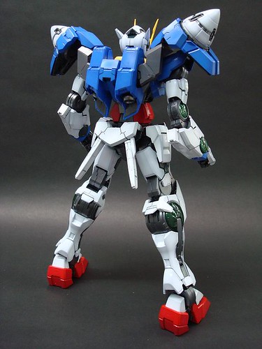
Very "thick" beam saber ^^;
Also, it seems that you can open/close the mount racks for GN Sword IIs on the side skirt armors
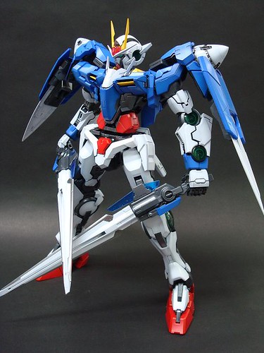
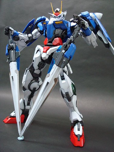
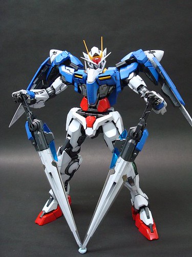
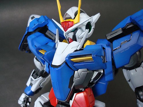
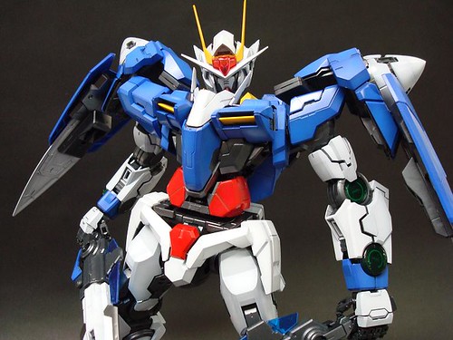
Exposing that much of waist joint's frame isn't really appealing to me really, especially when it's so squarish ^^;
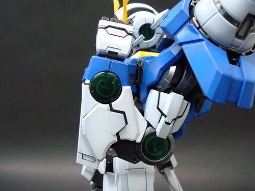
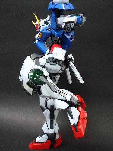
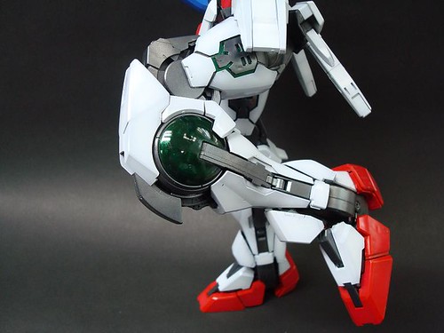
Clear green parts on the thigh it seems? ^^
Very detailed as it is, there's something not really right about this PG 00 Gundam (Raiser), but I can't really word it right, for so many days now after the 49th All Japan Plamodel Radicon Show when we get to see plenty of it there.
My feeling tells me that there's this rather imbalance mix of the original design and new details. It's clear that the designer is trying to incorporate new details onto the different parts of this PG, but the overall design is still too conservative and follows that from the anime too much. That sense of familiarity seems to keep on giving us the idea, "What's so special about it anyway?" even though there are indeed special points here and there.
The body design isn't as dynamic as PG Strike as well, that's the other feeling I have. Shoulder armors are a bit too small, that blue piece on the abdomen is a bit too big, the thighs are a bit too short, the waist is a bit too slim, and the calf is a bit too thin. Not so natural-looking as Strike in my opinion.
Not the right mix of mecha and more-human-like design maybe? Previous PGs like Gundam Mk. II and GP01 emphasize most on the mecha design, so you really get to feel their very realistic machine design; Strike emphasized on human-like design, the proportion of the body is almost just right as compared to a human being.
I see a mix between the two deign points, and it's not really to my taste. ^^;
Just my feeling really, and it's mixed. Normally I don't have such trouble. Like it and like it, vice versa. Hopefully more images will be coming soon to clear things up.
All images from Meister Sekita's Modeling Blog.

